
The answer to the question in the title is yes. This is one point to the fans of the Blue team, but the game is not over yet. What if a Blue team fan complains “The electoral college favors the big Red mountain states with small populations at the expense of the poor Blue states”? Then I think this fan should stop saying this, since it’s not true. Instead, start saying “The electoral college favors the big Red mountain states but the small, North Eastern Blue states are favored more.” Does the Blue fan also complain “The Blue states with large urban populations suffer under the electoral system.”? I think the fan should stop saying this half truth, too. Instead, the sentence should be completed as “The Blue states with large urban populations suffer under the electoral system, but the Red states with large populations suffer more.”
Many people want to demolish the electoral system and decide elections by popular vote only. No doubt, a few “smart” people shouldn’t be able to overrule the people’s choice. On the other hand, big states shouldn’t be able to push around small states the way they see fit.
Perhaps the following would work
The reader has to understand the US electoral college system as it is explained in the first four paragraphs of
The reader also needs to understand that in the US, the color Blue is associated with the Democratic party and the color Red is associated with the Republican party.
From mathematics, all is needed is to understand what it means to take the ratio of two numbers.
I heard quite a few arguments against the “ancient” electoral college system, but I think two important ones don’t hold water. One of them is
“Big, Red mountain states with small populations are favored by the US electoral system at the expense of Blue states.”
which is usually accompanied by
“The Blue states with large populations suffer under the US electoral system, while the Red states are having a ball. ”
In fact, both of these statements are certifiably false, as we will see. Yes, this means that exactly the opposite of the above two statements are true—though the drama needs to be toned down.
On the other hand, it does seem that the electoral system is rigged, and the problem seems to occur so consistently that it’s difficult for the observer to think, it’s accidental, though I am quite sure it is accidental.
I am not talking about the well known, crazy practice of giving all the electoral votes of a state to the winning candidate of the state even if the win was ensured only by a few votes. No, this is an almost uniform practice (only Nebraska and Maine are exceptions), and I don’t think it can explicitly favor one state over another, or one party over the other. What I am talking about is a problem with the actual distribution of the number of electors among the states: the Red states get a better distribution, and this better distribution seems to occur consistently.
This is bad news, but there is good news. The change needed to make this bias disappear is (mathematically!) simple, namely, create a better, fairer distribution.
Since it really seems reasonable to also make sure, the vote of the states with small populations don’t get completely nullified by the votes in large states, the following two-point scheme basically presents itself.
I think any statistics trying to examine the fairness of the electoral system considers, one way or another, the number of people per elector in a given state, in other words, how many people are represented by each elector. I refer to this ratio as the state’s electoral rate or electoral quotient. So to calculate a state’s electoral rate, I divide a given state’s population P by the number of electors E in that state, so I take P∕E. For example, if a state’s population is 1 million, so P = 1,000,000, and it has 5 people in its electoral college, so E = 5, then that state’s electoral rate P∕E is
|
| (1) |
The meaning of P∕E is that each elector in this state represents 200 thousand people.
The smaller the electoral ratio P∕E is, the more influence each person in the state has in the elections. We can and do say that in a state with small P∕E ratio, people are in a better position in the electoral system, since their vote has greater weight during elections than those in a state with larger P∕E ratio.
At the end of these notes, in chart 1, we can find a ranking of the 51 states based on their P∕E ratio: states with small P∕E are close to the top of the list, and states with large P∕E are closer to the bottom of the list. For states around the top of the list, P∕E is about 200,000 people (Wyoming 1st, Vermont 2nd) while close to the bottom, the ratio P∕E is about 700,000 people (Florida worst, Texas 2nd worst). This is roughly a 1 : 3 ratio between those states which are best and worst in the list.
What we do is we look at the ranking of the 51 states based on their P∕E ratio, and we examine the states in the bottom third, the top third and middle third. We’ll see that in the top or the bottom, the Blue states have clear advantage—contrary to the conventional wisdom. In the middle, the Red states completely compensate for what they lose in the bottom and top.
What we will also notice, quite surprisingly, that in every one of the groups the “group electoral rate” is lower for the Red states. More precisely, when we take the ratio of the total Red state population TP in a group and divide it by the total Red state electors TE in the group, the ratio TP∕TE is less than the same ratio for the Blue states in that group. What we find is that that this TP∕TE ratio is smaller for the Red states than for the Blue states in all three groups.
Incidentally, the nationwide electoral ratio is also favorable to the Reds. So if we divide the total US population who lived in Red states in 2016 by the total number of electors of the Red states then we get a smaller number than if we calculate the same ratio for the Blue states.
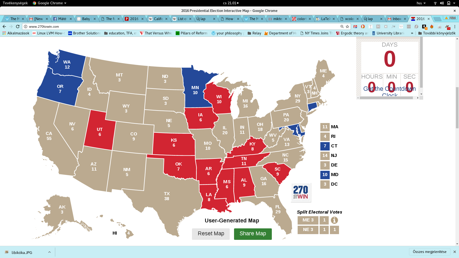
Let’s see first that, in fact, the populous Red states have it worse than the populous Blue states. To this end, let us look at the bottom third—so the bottom 17 states—of the ranking according to the P∕E ratio, so we look at the states with the 17 highest P∕E ratio. I marked these states on a map which can be viewed here
Here is the electoral rate P∕E chart for this bottom group, with Indiana in the best position and Florida in the worst.
| State | P∕E | |
| Indiana | 601,789 | |
| Colorado | 606,286 | |
| Missouri | 608,367 | |
| Massachusetts | 617,675 | |
| Michigan | 620,161 | |
| Arizona | 620,733 | |
| Georgia | 638,429 | |
| New Jersey | 639,858 | |
| Pennsylvania | 640,125 | |
| Illinois | 643,000 | |
| Virginia | 644,846 | |
| Ohio | 645,190 | |
| North Carolina | 669,520 | |
| New York | 682,613 | |
| California | 711,724 | |
| Texas | 722,871 | |
| Florida | 723,974 |
So there are 7 Blue and 10 Red states in this group. Their total populations, as can be seen in chart 1, are as follows.
| Total population of 10 Red states in the bottom third | 122 million |
| Total population of 7 Blue states in the bottom third: | 101 million |
| Difference (more in Red states): | 21 million |
| Difference as a percentage of Blue population: | 20%. |
In other words, 101 million people live in Blue states that are in the bottom third of the electoral rate ranking versus 122 million people who live in Red states belonging to this group. The Reds have it worse, since 20 million more Red-state people have low weight in the elections than Blue-state people. We can also say that “the Reds have it 20% worse than the Blues in this bottom group”.
We see that population-wise, the Red states are at a 20% a disadvantage in this group. How about elector-wise? What happens if we compare the total number of electors in this group?
| Total number of electors in 10 Red states in the bottom third | 183 |
| Total number of electors in 7 Blue states in the bottom third: | 151 |
| Difference (more in Red states): | 32 |
| Difference as a percentage of Blue electors: | 21%. |
So, the number of electors shows similar differences to the population differences. What is notable here is that elector-wise, the Reds have 21% more electors than the Blues, while population-wise the Reds have only 20% greater population than the Blues.
In other words, the Red states in this group are slightly favored by the Electoral college. To quantify this, let us calculate the group electoral ratio for the Blue and Red states in this bottom group. We get this group ratio by dividing the total population by the total number of electors. For example, we calculate the average rate for the 10 Red states in this group by taking their total population TP = 122 million and divide it by the total number of electors TE = 183. Using more precise numbers from the chart 1, we get
| Group electoral rate of 10 Red states in the bottom third: | 665,945 |
| Group electoral rate of 7 Blue states in the bottom third: | 671,474 |
| Difference (more for Blue): | 5,529 |
| Difference as a percentage of Red electoral rate: | 0.8%. |
Compared to what we are going to see in the other two groups, this 0.8% difference is small—but it’s here, nevertheless.
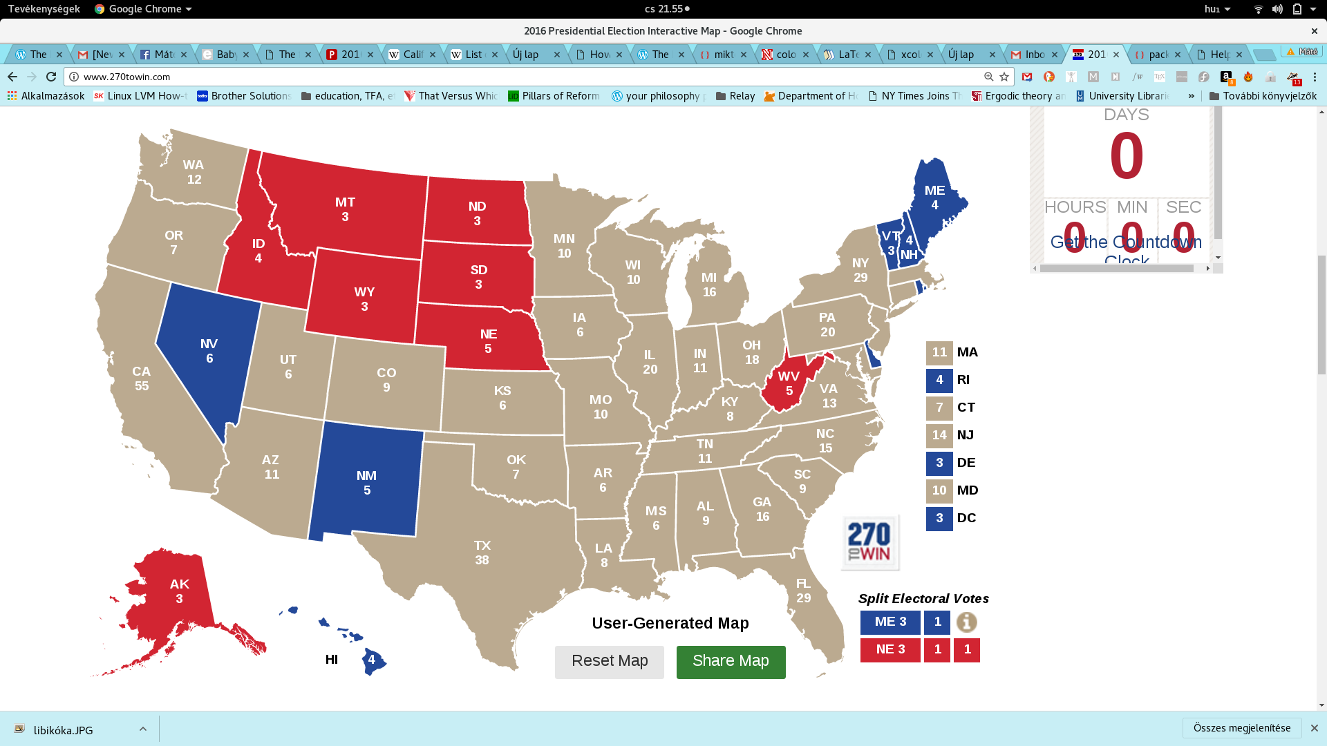
Let us now look at the top third, so the top 17 states, in the ranking according to their P∕E ratio. We can view these states on the map here
The actual P∕E numbers are in this chart
| State | P∕E |
| Wyoming | 195,369 |
| Vermont | 208,681 |
| District of Columbia | 224,076 |
| Alaska | 246,144 |
| North Dakota | 252,309 |
| Rhode Island | 264,075 |
| South Dakota | 286,156 |
| Delaware | 315,311 |
| Maine | 332,332 |
| New Hampshire | 332,652 |
| Montana | 344,316 |
| Hawaii | 357,901 |
| West Virginia | 368,826 |
| Nebraska | 379,238 |
| Idaho | 413,733 |
| New Mexico | 417,022 |
| Nevada | 481,808 |
So there are 9 Blue and 8 Red states in the top third of the elector rate list. Their total population is
| Total population of 8 Red states in the top third | 9 million |
| Total population of 9 Blue states in the top third: | 12 million |
| Difference (more in Blue states): | 3 million |
| Difference as a percentage of Red population: | 32%. |
In other words, 12 million people live in Blue states that are in the top third of the electoral rate ranking versus 9 million people who live in Red states belonging to this group. The Blues have it better, I’d say, since 3 million more Blue-state people have high weight in the elections than Red-state people. This difference in population is significant: it means 32% more people live in Blue states that are in this highest group than in Red states.
Elector-wise, we get
| Total number of electors in 8 Red states in the top third | 29 |
| Total number of electors in 7 Blue states in the top third: | 36 |
| Difference (more in Blue states): | 7 |
| Difference as a percentage of Red electors: | 24%. |
What we see is that while the Blues have 32% greater population than the Reds, they only have 24% more electors. This suggests that the electoral college again favors the Reds, and this time we expect a greater Red bias than what we saw in the bottom group.
How much does the electoral system favor the Red states in this top group? Let us calculate the group elector rate TP∕TE for this group as well
| Group electoral rate of 8 Red states in the top third: | 323,039 |
| Group electoral rate of 9 Blue states in the top third: | 343,555 |
| Difference (more for Blue): | 20,516 |
| Difference as a percentage of Red electoral rate: | 6.4%. |
So the Reds’ elector rate is 6% better than the Blues’ in the top group.
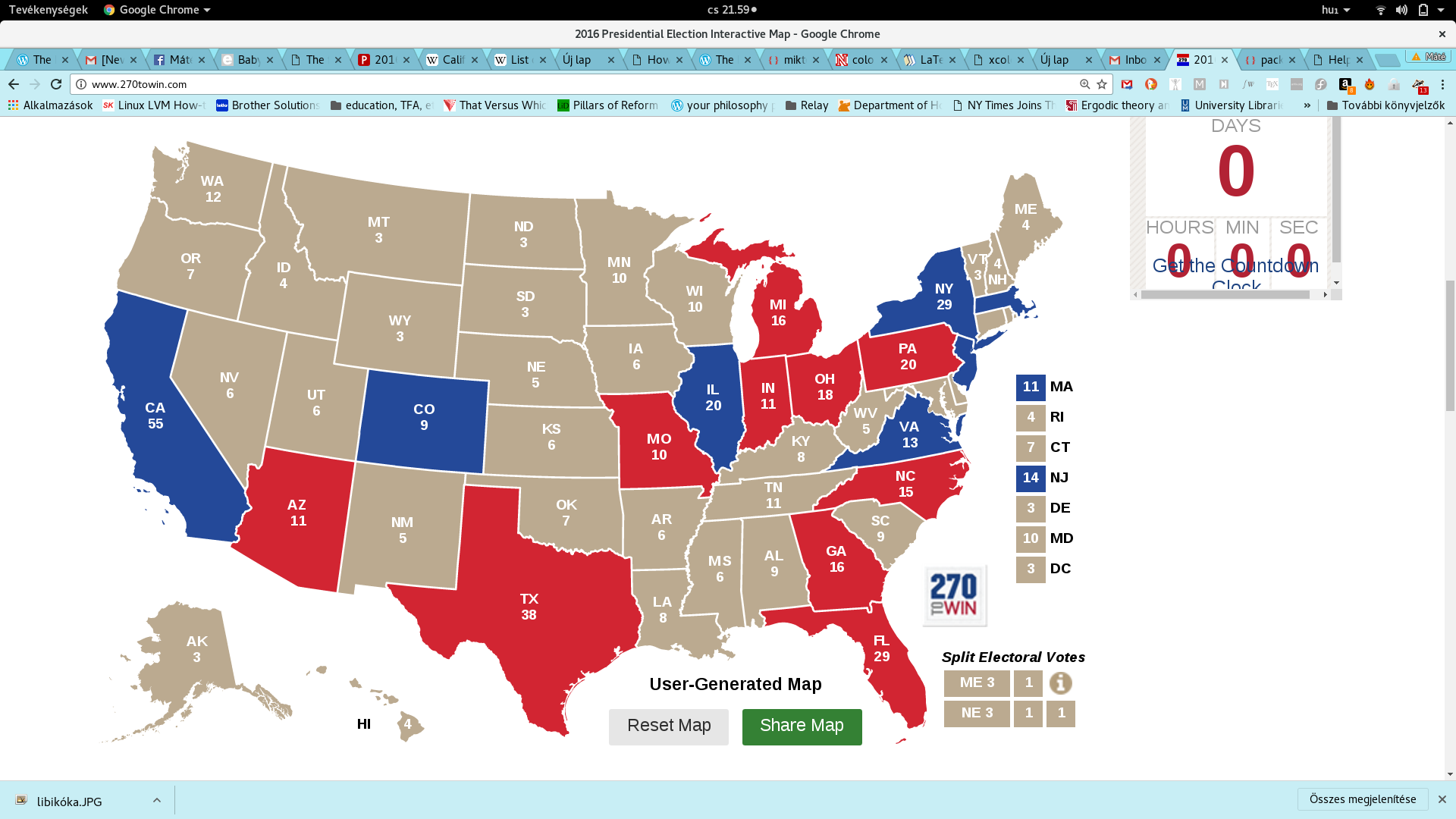
Let us look at the final 17 states in the ranking of the states according to their elector rate P∕E. We call this group the middle group. We can view these states on the map here
The actual P∕E numbers are in this chart
| State | P∕E |
| Kansas | 485,274 |
| Arkansas | 496,367 |
| Mississippi | 498,722 |
| Utah | 499,320 |
| Connecticut | 512,984 |
| Iowa | 520,650 |
| Alabama | 539,887 |
| South Carolina | 544,016 |
| Minnesota | 548,959 |
| Kentucky | 553,137 |
| Oklahoma | 558,763 |
| Oregon | 575,568 |
| Wisconsin | 577,134 |
| Louisiana | 583,841 |
| Washington | 597,529 |
| Tennessee | 600,027 |
| Maryland | 600,640 |
So there are 5 Blue and 12 Red states in the middle third of the state elector rate ranking. Their total population is
| Total population of 12 Red states in the middle third | 50 million |
| Total population of 5 Blue states in the middle third: | 26 million |
| Difference (more in Red states): | 24 million |
| Difference as a percentage of Blue population: | 92%. |
In other words, 26 million people live in Blue states that are in the middle third of the electoral rate ranking versus 50 million people who live in Red states belonging to this group. The Reds have it much better since 24 million more people in Red states have “middle” weight in the elections than people in Blue states.
We see that this 50 million is close to being double that of 26 million: 50 million is 92% more than 26 million.
Also, notable is the fact that this 24 million difference in this middle group is basically equal to the combined differences between the two colors in the top third and bottom third groups.
Elector-wise, we get
| Total number of electors in 12 Red states in the top third | 92 |
| Total number of electors in 5 Blue states in the top third: | 46 |
| Difference (more for Red states): | 46 |
| Difference as a percentage of Blue electors: | 100%. |
What we see is that while the Reds have 92% greater population than the Blues, they have 100% more electors. This yet again suggests that the electoral college favors the Reds in this middle group as well.
How much does the electoral system favor the Red states in this middle group? Let us calculate the group elector rate TP∕TE for this group as well
| Group electoral rate of 12 Red states in the bottom third: | 544,956 |
| Group electoral rate of 5 Blue states in the bottom third: | 571,439 |
| Difference (more for Blue): | 26,483 |
| Difference as a percentage of Red electoral rate: | 5%. |
So the Reds’ elector rate is 5% better than the Blues’ in this middle group.
We have seen three quite surprising statistics just by looking at the simple idea of ranking the US states based on their elector rate and dividing the states into three groups based on this ranking.
In connection with the last observation, I felt like calculating the nationwide Red and Blue elector rates. What I got was not surprising anymore: the Red states have a better overall ratio than the Blue ones by 4,441. This 4,441 is 0.7% of the Red elector rate P∕T. To put this insignificant looking 0.7% into perspective: in this 2016 election year, Clinton won the popular vote by a smaller margin: by less than 0.6%.
As a farewell bonus task, I thought it would be interesting to add some numbers to the claim that says something like
“The electoral vote was significantly different from the popular vote this year.”
What we know is that though Clinton won the popular vote, the vote counts of the two candidates were roughly the same—less than 1% difference. On the other hand, the total number of Red electors is 304 while the total number of Blue ones is 233. The difference is 71 which is 30% of the number of Blue state electors. That’s quite an astonishing percent, isn’t it?
What does this 30% mean if we translate it to voting population? Well, this year, the total number of voters was 120 million. If we divided up this 120 million the same way the 535 electoral votes got divided, Trump would get 68 million votes and Clinton would get 52 million votes. Instead, each candidate got about 60-60 million votes. We can say, the electoral system added an extra 8 million votes to Trump and took away 8 million votes from Clinton.
To appreciate this 8 million votes, note that only 3 states turned out more than 8 million voters: California (8.5 million), Florida (9 million), Texas (8.4 million).
| State | P∕E | P | E | P. Total | E. Total | TP∕TE |
| Wyoming | 195,369 | 586,107 | 3 | |||
| Vermont | 208,681 | 626,042 | 3 | |||
| District of Columbia | 224,076 | 672,228 | 3 | |||
| Alaska | 246,144 | 738,432 | 3 | |||
| North Dakota | 252,309 | 756,927 | 3 | |||
| Rhode Island | 264,075 | 1,056,298 | 4 | |||
| South Dakota | 286,156 | 858,469 | 3 | |||
| Delaware | 315,311 | 945,934 | 3 | |||
| Maine | 332,332 | 1,329,328 | 4 | |||
| New Hampshire | 332,652 | 1,330,608 | 4 | |||
| Montana | 344,316 | 1,032,949 | 3 | |||
| Hawaii | 357,901 | 1,431,603 | 4 | |||
| West Virginia | 368,826 | 1,844,128 | 5 | |||
| Nebraska | 379,238 | 1,896,190 | 5 | |||
| Idaho | 413,733 | 1,654,930 | 4 | 9,368,132 | 29 | 323,039 |
| New Mexico | 417,022 | 2,085,109 | 5 | |||
| Nevada | 481,808 | 2,890,845 | 6 | 12,367,995 | 36 | 343,555 |
| Kansas | 485,274 | 2,911,641 | 6 | |||
| Arkansas | 496,367 | 2,978,204 | 6 | |||
| Mississippi | 498,722 | 2,992,333 | 6 | |||
| Utah | 499,320 | 2,995,919 | 6 | |||
| Connecticut | 512,984 | 3,590,886 | 7 | |||
| Iowa | 520,650 | 3,123,899 | 6 | |||
| Alabama | 539,887 | 4,858,979 | 9 | |||
| South Carolina | 544,016 | 4,896,146 | 9 | |||
| Minnesota | 548,959 | 5,489,594 | 10 | |||
| Kentucky | 553,137 | 4,425,092 | 8 | |||
| Oklahoma | 558,763 | 3,911,338 | 7 | |||
| Oregon | 575,568 | 4,028,977 | 7 | |||
| Wisconsin | 577,134 | 5,771,337 | 10 | |||
| Louisiana | 583,841 | 4,670,724 | 8 | |||
| Washington | 597,529 | 7,170,351 | 12 | |||
| Tennessee | 600,027 | 6,600,299 | 11 | 50,135,911 | 92 | 544,956 |
| Maryland | 600,640 | 6,006,401 | 10 | 26,286,209 | 46 | 571,439 |
| Indiana | 601,789 | 6,619,680 | 11 | |||
| Colorado | 606,286 | 5,456,574 | 9 | |||
| Missouri | 608,367 | 6,083,672 | 10 | |||
| Massachusetts | 617,675 | 6,794,422 | 11 | |||
| Michigan | 620,161 | 9,922,576 | 16 | |||
| Arizona | 620,733 | 6,828,065 | 11 | |||
| Georgia | 638,429 | 10,214,860 | 16 | |||
| New Jersey | 639,858 | 8,958,013 | 14 | |||
| Pennsylvania | 640,125 | 12,802,503 | 20 | |||
| Illinois | 643,000 | 12,859,995 | 20 | |||
| Virginia | 644,846 | 8,382,993 | 13 | |||
| Ohio | 645,190 | 11,613,423 | 18 | |||
| North Carolina | 669,520 | 10,042,802 | 15 | |||
| New York | 682,613 | 19,795,791 | 29 | |||
| California | 711,724 | 39,144,818 | 55 | 101,392,606 | 151 | 671,474 |
| Texas | 722,871 | 27,469,114 | 38 | |||
| Florida | 723,974 | 20,271,272 | 28 | 121,867,967 | 183 | 665,945 |
Here is a weblink to the PDF version of this document
Here is the Excel file containing the data and my calculations, including the formulas.
Note that the voting data is approximate and correspond to those avaiable on Nov 9, 2016. But I didn’t use the actual vote counts anywhere except when I said that about 60-60 million people voted for each candidate.